Oscillations
Johanna Daas, Jonas Förster and Jürgen Pahle
Google Colab
If you want to work on this worksheet yourself, try it out on Google Colab.
Introduction
Why are oscillations so fascinating for science? Here, you will find an answer to that question (hopefully), as well as learn how to code with CoRC.
This is a teaching document. Whenever there is a code chunk, you can run it. But (as you will quickly see), it will not be completed. Some of the code, you will have to put in by yourself to get to the next result. But don’t worry: We will guide you through everything. Don’t be shy to be creative with your coding - it is about all learning by doing.
If you need help, click on the “Hint” tab. There we will give you
some pointers on where to look, as well as some extra code to guide you
in the right direction. But it is always a good idea to use Google as
well if you don’t know how a certain function works. You can also use
the intrinsic help-function of R: The ?
function gives you the documentation for that function. If you forgot
the specific name, you can also use the ?? function for
fuzzy search.
If you are completely lost, you can take a look at the “Solution” tab. Here we will give you the completed code with explanations on why it is working. Of course you can use the Solution tab to check if your result is correct. But don’t worry, if your code does not look like ours. If it achieves the same result, it is just as valid. But it can’t hurt to take a look at where your solution is different from ours and to try and understand, why we did what we did.
We assume that you already know how to work with CoRC a bit or have gone through our examples. Also, it helps if you already have some experience with ggplot, but that is not a necessity.
Getting used to our system
Code
This is an example on how our tabs work. You can click on the others to get help or take a look at our solution.
Hint
You successfully clicked on our “Hint” tab. They should point you in the right direction.
Solution
This is our Solution tab. If you clicked on it and this message is showing, everything is working as it should. Now, on with the coding!
Setup
To set up our work with CoRC, we first need to
install it and tell R that we will be using it. For
this, we will call the library() function and optionally
the install.packages() function.
Code
# Your code hereIt is good practice to set up all libraries at the beginning of your document and not at the point where you first need them. This avoids confusion. So we will also need to tell R about the other packages. We will be using: tidyr and dplyr for data wrangling and ggplot2 and plotly for plotting.
Hint
You need to call the library() function with the package
you want to call as an argument.
You also need to make sure to have the package installed before
calling it with the library function. If you are unsure if you have the
required packages installed, you can check by using
find.package(). If you have the package installed, it will
tell you where it is installed.
find.package("CoRC")
#> [1] "/Users/juergenpahle/software/R/library/CoRC"
Solution
You may first need to install the packages CoRC, dplyr, tidyr, ggplot and plotly.
# Install CoRC.
install.packages("remotes")
remotes::install_github("jpahle/CoRC")

# Install further packages
install.packages("dplyr")
install.packages("tidyr")
install.packages("ggplot2")
install.packages("plotly")
Now, we want to load all of these packages with the
library() function:
library(dplyr)
library(tidyr)
library(ggplot2)
library(plotly)
library(CoRC)
And done! We have set up our worksheet :)
Loading a model
The first thing to do is to load a model we can work with.
This implementation is an example from the Condor-Copasi paper1! You can find the model here:
loadModel("https://raw.githubusercontent.com/copasi/condor-copasi/master/examples/stochastic_test.cps")
#> # A COPASI model reference:
#> Model name: "Kummer calcium model"
#> Number of compartments: 1
#> Number of species: 3
#> Number of reactions: 8
If the above does not work, try
loadModel("https://raw.githubusercontent.com/jpahle/DynamiCoRC/main/models/stochastic_test.cps")Code
Make yourself familiar with the model and take a look at the species and the reactions.
Hint
To inspect an element with CoRC you use the get family of functions.
Solution
We want to look at the species and the reactions. To look at the species we run:
getSpecies()
#> # A tibble: 3 × 13
#>   key            name  compartment type   unit  initial_concentr… initial_number
#>   <chr>          <chr> <chr>       <chr>  <chr>             <dbl>          <dbl>
#> 1 a{compartment} a     compartment react… nmol…                 8           482.
#> 2 b{compartment} b     compartment react… nmol…                 8           482.
#> 3 c{compartment} c     compartment react… nmol…                 8           482.
#> # … with 6 more variables: concentration <dbl>, number <dbl>, rate <dbl>,
#> #   number_rate <dbl>, initial_expression <chr>, expression <chr>
and to look at the reactions
getReactions()
#> # A tibble: 8 × 6
#>   key   name  reaction    rate_law                              flux number_flux
#>   <chr> <chr> <chr>       <chr>                                <dbl>       <dbl>
#> 1 (R1)  R1    " -> a"     FunctionDB.Functions[Constant flux …   NaN         NaN
#> 2 (R2)  R2    " -> a;  a" FunctionDB.Functions[linear activat…   NaN         NaN
#> 3 (R3)  R3    "a -> ;  b" FunctionDB.Functions[Irr Michaelis-…   NaN         NaN
#> 4 (R4)  R4    "a -> ;  c" FunctionDB.Functions[Irr Michaelis-…   NaN         NaN
#> 5 (R5)  R5    " -> b;  a" FunctionDB.Functions[linear activat…   NaN         NaN
#> 6 (R6)  R6    "b -> "     FunctionDB.Functions[Henri-Michaeli…   NaN         NaN
#> 7 (R7)  R7    " -> c;  a" FunctionDB.Functions[linear activat…   NaN         NaN
#> 8 (R8)  R8    "c -> "     FunctionDB.Functions[Henri-Michaeli…   NaN         NaN
Visualising species
We want to show how species a behaves over time. For this, we first have to run a time course.
timecourse <- runTimeCourse()$result

timecourse
#> # A tibble: 801 × 4
#>     Time     a     b     c
#>    <dbl> <dbl> <dbl> <dbl>
#>  1  0     8.00  8.00 8.00
#>  2  0.05  6.99  8.12 5.13
#>  3  0.1   6.94  8.32 2.52
#>  4  0.15  7.19  8.45 0.316
#>  5  0.2   7.77  8.54 0.648
#>  6  0.25  8.04  8.62 0.199
#>  7  0.3   8.44  8.82 0.365
#>  8  0.35  9.15  9.07 0.548
#>  9  0.4   9.48  9.37 1.01
#> 10  0.45 10.4   9.32 0.399
#> # … with 791 more rows
Code
Fill in the missing code to visualise species a!
ggplot(data = ) +
  geom_line(aes(x = , y = ))
Hint
The visualisation uses the package ggplot2. If you are unfamiliar with that, you can look up some documentation about it on the ggplot2 website.
You have to think about what is missing here.
There are some equal signs that only have one side filled out.
data, x, and y specify what we
want to plot.
Solution
data specifies the data frame ggplot draws its data
from. We have created a time course table that we want to plot, so this
is our data.
x is the x-axis of our plot (the time) and
y the y-axis (concentration of a). We find both in our data
frame that we provided with data.
We fill this into our code.
ggplot(data = timecourse) +
  geom_line(aes(x = Time, y = a))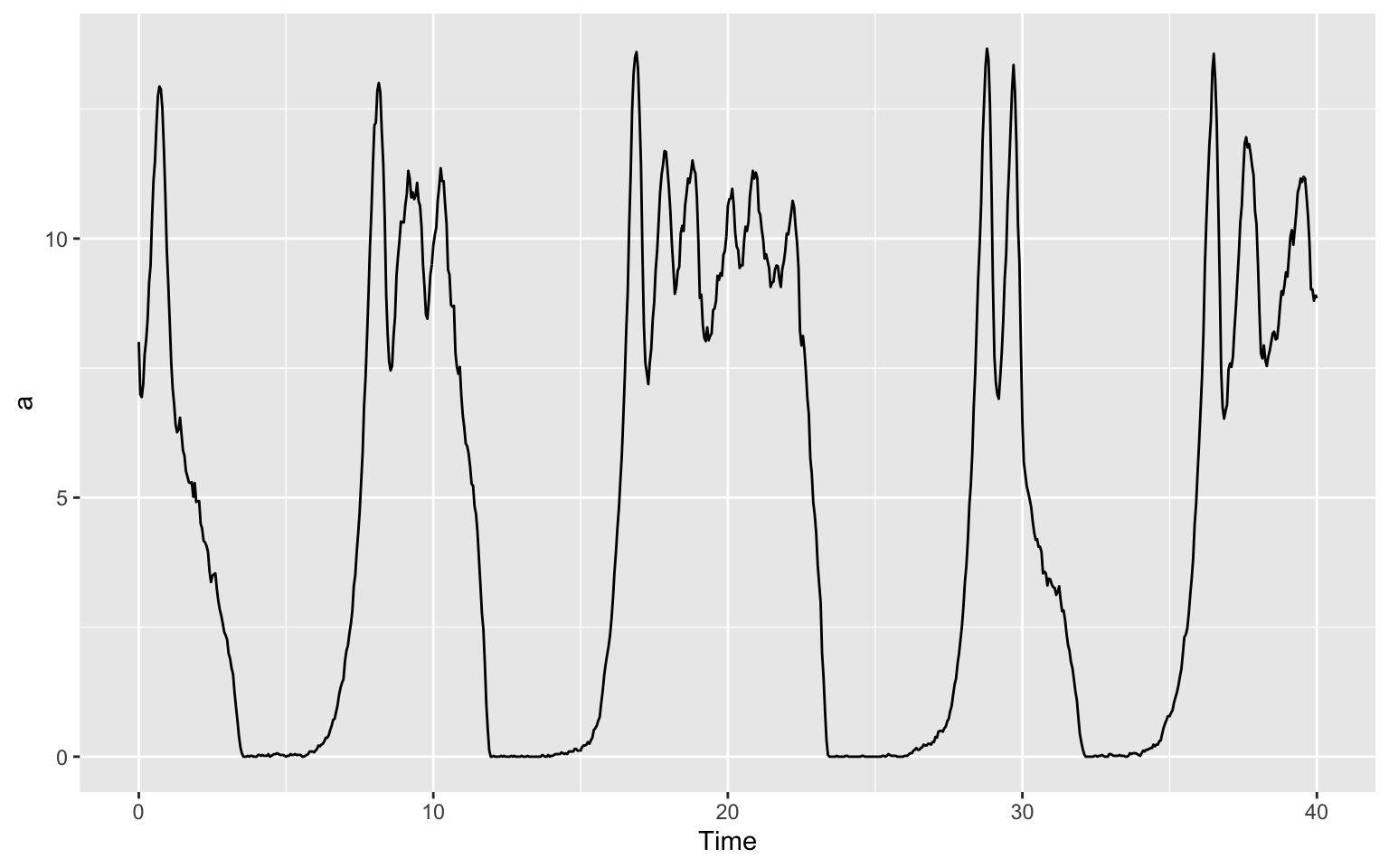
Now, can you do the same for b and c?
Code
# Your code hereHint
Take a look at the code for visualising a and think about what is the same and what is different for b and c.
Solution
What we have to change about the code form above is the part telling ggplot what we want to have on our y-axis. In the last plot, we wanted a there and now we want b or c.
For b, this will look like this:
ggplot(data = timecourse) +
  geom_line(aes(x = Time, y = b))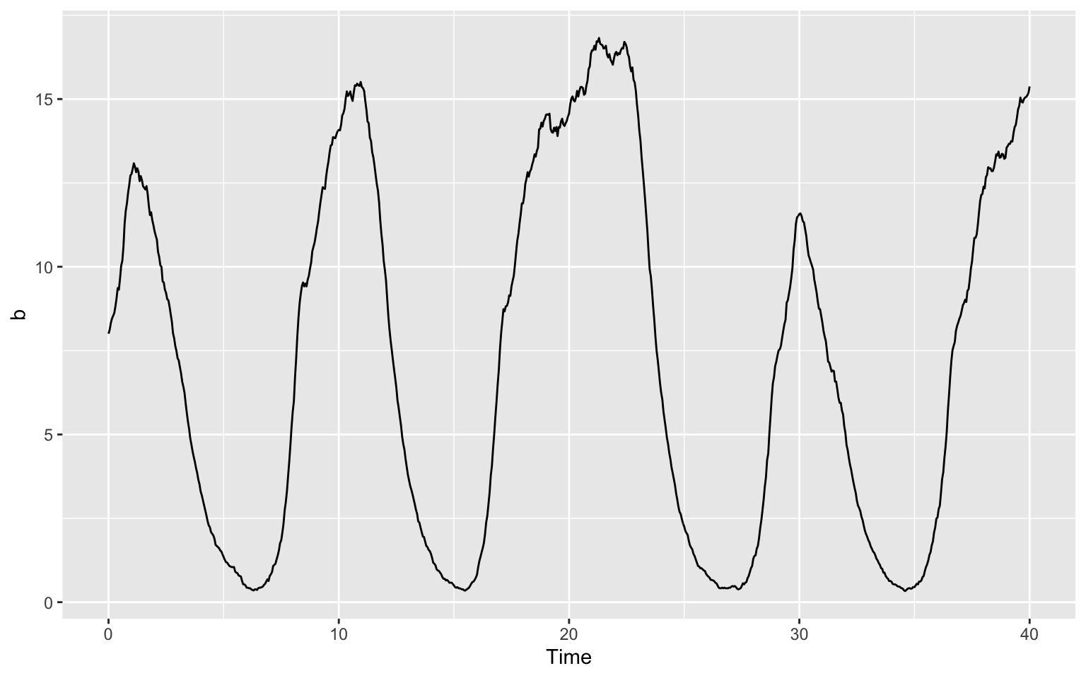
It is also nice to put all species in one plot. To see which species
are which, we will also colour the lines. We can tell ggplot implicitly
to colour a different than b by calling the colour
"a" and "b". Of course you can also explicitly
tell which colour to use by saying color = "red" (after the
aes() command) for example.
ggplot(data = timecourse) +
  geom_line(aes(x = Time, y = a, color = "a")) +
  geom_line(aes(x = Time, y = b, color = "b")) +
  geom_line(aes(x = Time, y = c, color = "c"))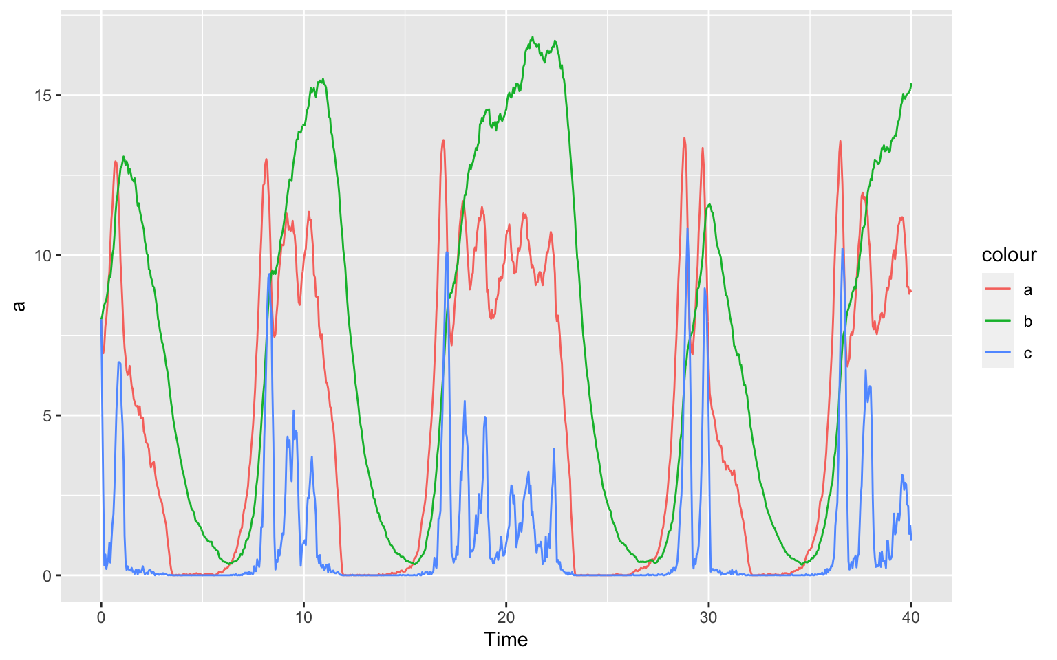
Oscillation
Now, the question presents itself: How and why does this model oscillate? And why does it matter?
To answer the last question first, oscillators are fascinating because a lot of (signalling and other) pathways in biology oscillate. You can think about why that might have some sort of evolutionary advantage. What is in our environment that changes over time in an oscillating way?
The first thing that might come to mind is our day-and-night-cycle. And indeed, we find oscillating signalling pathways here. Even without external stimuli these oscillations prevail. For example, one of biologists’ favorite pet, the fruit fly Drosophila melanogaster has the proteins PER (short for period) and TIM (short for timeless) that act as their “clock” (Tyson, 1999)2.
The fist question is a bit harder to answer.
Take a look at this oscillating model below:
This is a representation of a so called predator-prey model from Lotka-Volterra 3 4. We will build the model in the following tasks.
Species
We call the elements in our model “species”. Here, this is especially appropriate. We will have two species, “Cats” and “Mice”.
We will first have to create a new model and then our two species.
Code
# Your code hereHint
To create something new, we use the new family of functions. Just try it, your editor should autofill your functions, so you might find what you need that way.
Solution
# First, make a new model
newModel()
#> # A COPASI model reference:
#> Model name: "New Model"
#> Number of compartments: 0
#> Number of species: 0
#> Number of reactions: 0

# Then two new species
newSpecies("Cats")
#> [1] "Cats{compartment}"
newSpecies("Mice")
#> [1] "Mice{compartment}"
Reactions
We will want to create 4 reactions in our model:
- Cats multiplying
- Mice multiplying
- Cats dying
- Mice dying
Remember, Cats need Mice to multiply!
Code
# newReaction()Hint
We want to create a reaction for breeding and one for dying. For mice this might look like this:
# Mice being born:
newReaction("Mice -> 2 * Mice")

# Mice dying:
newReaction("Mice ->")
Try it yourself for the Cats. It will look similar, but remember, Cats need to eat!
Solution
When creating a reaction, we need to use the
newReaction() function.
For the “dying”-functions, we tell CoRC that there was something there and then it isn’t there anymore:
# Cats dying
newReaction("Cats -> ")
#> [1] "(Cats ->)"
# Mice dying
newReaction("Mice -> ")
#> [1] "(Mice ->)"
For more mice we need mice in the first place, so a similar ” -> Mice” won’t work, even if this is possible in CoRC. This would be the case if we have a constant migration of mice into our space. Instead we will multiply mice and cats, while cats also need to eat mice in order to multiply:
# Mice multiply
newReaction("Mice -> 2 * Mice")
#> [1] "(Mice -> 2 * Mice)"

# Cats eat Mice to multiply
newReaction("Cats + Mice -> 2 * Cats")
#> [1] "(Cats + Mice -> 2 * Cats)"
Because we are working in the abstract we can say that one mouse can create two mice, even if that doesn’t model reality very faithfully.
Scale of the model
Take a look at our model now:
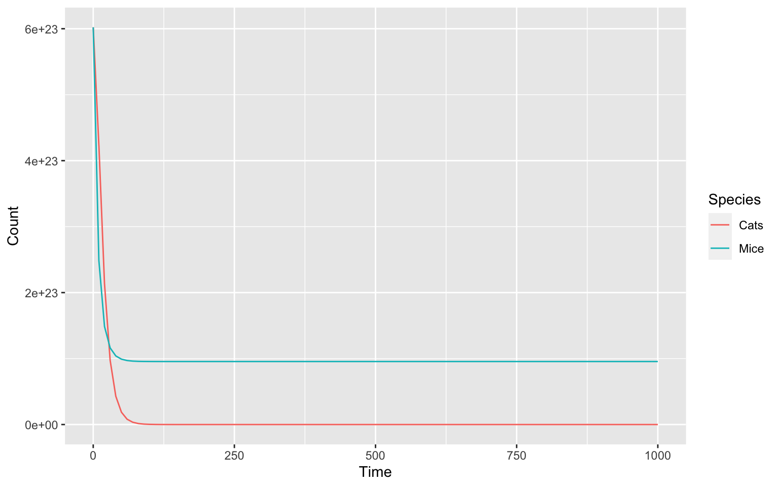
We see that it does not yet behave in a way we want it to. This is because we still need to take a look at the parameters of our model.
Most obviously, we can see that the model is calculating the numbers
of cats and mice on a massive scale to the power of 23. This is because
COPASI by default is set to work on a molecular scale, where particle
numbers are usually given in moles and as such scaled by the
Avogradro constant. Here we would like to work on a much
smaller scale and we can use setCompartments to help us
achieve that. The argument preserve_concentrations set to
TRUE will cause it to scale down the particle numbers.
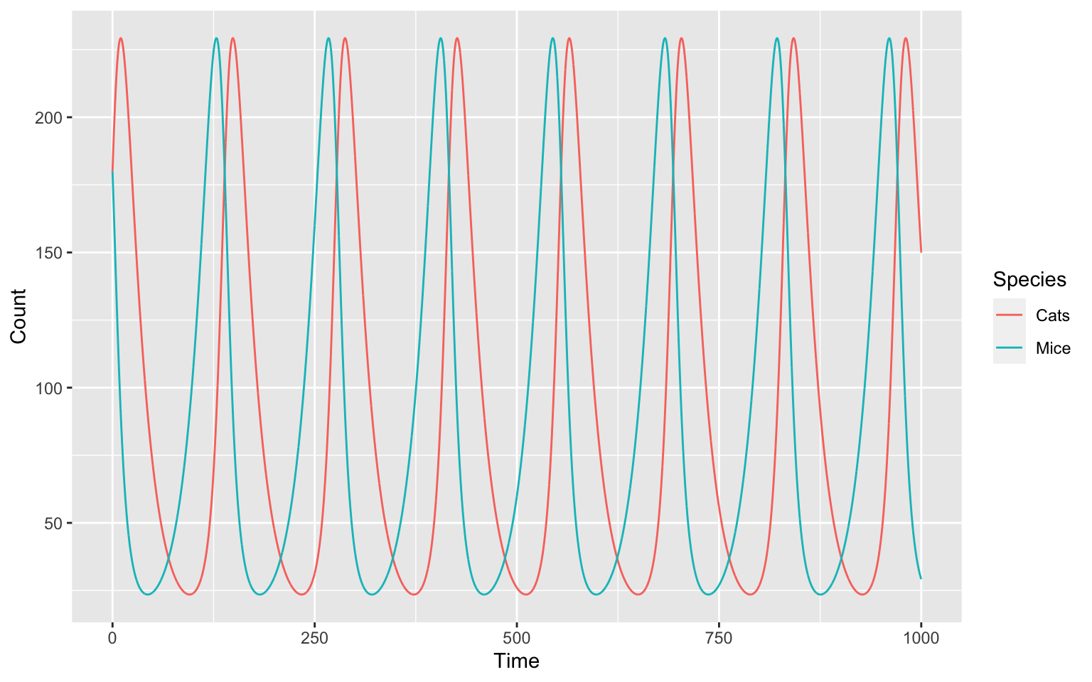
setCompartments("compartment", initial_size = 3e-21, preserve_concentrations = TRUE)runTC(duration = 1000)$result_number %>%
pivot_longer(-Time, names_to = "Species", values_to = "Count") %>%
ggplot() +
geom_line(aes(x = Time, y = Count, color = Species))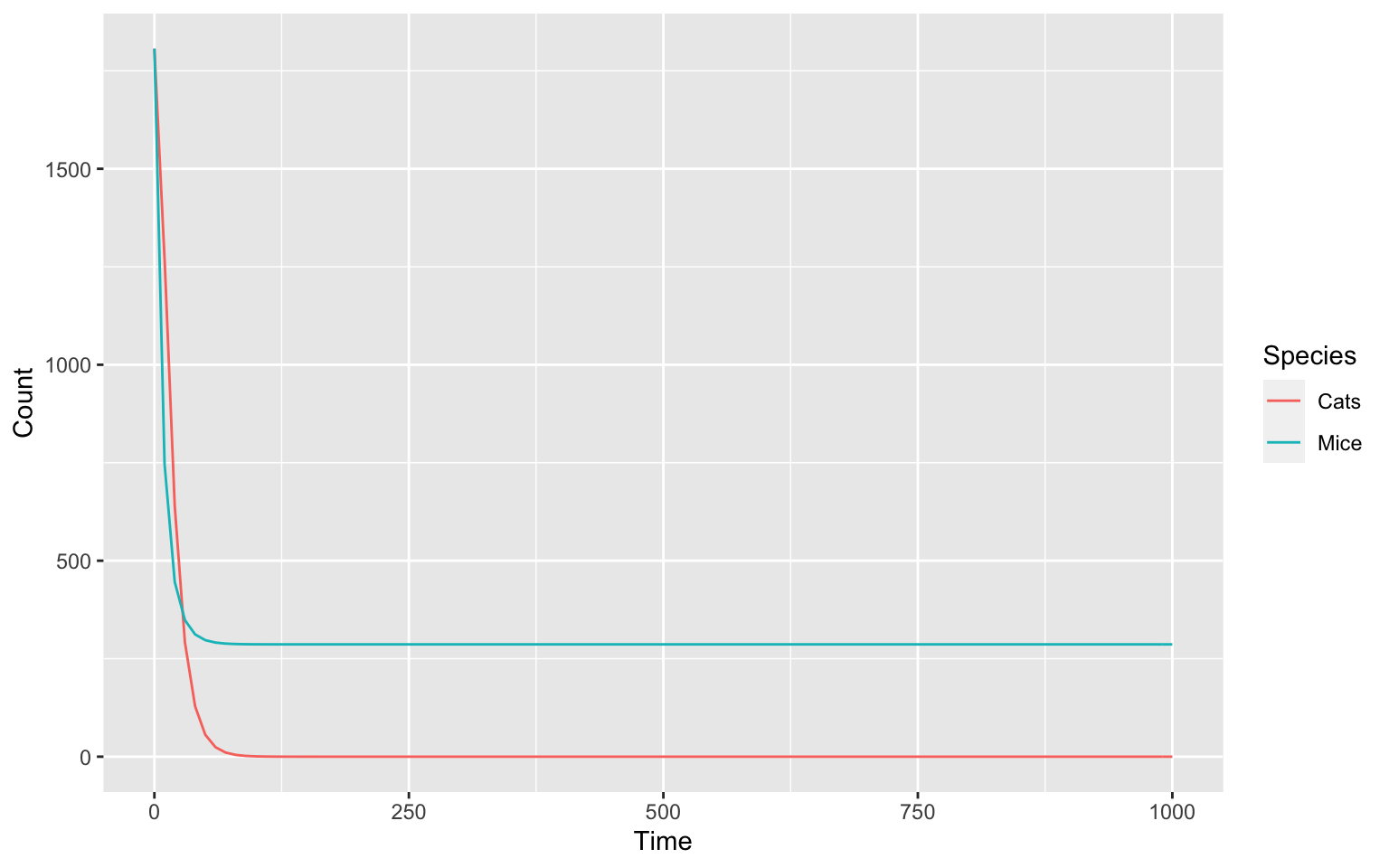
We can take a look at our species after this change:
getSpecies()
#> # A tibble: 2 × 13
#>   key          name  compartment type    unit  initial_concentra… initial_number
#>   <chr>        <chr> <chr>       <chr>   <chr>              <dbl>          <dbl>
#> 1 Cats{compar… Cats  compartment reacti… mol/l                  1          1807.
#> 2 Mice{compar… Mice  compartment reacti… mol/l                  1          1807.
#> # … with 6 more variables: concentration <dbl>, number <dbl>, rate <dbl>,
#> #   number_rate <dbl>, initial_expression <chr>, expression <chr>
In the initial_number column we see an equally odd
number for both species. Lets fine tune it with a set command.
We can do this one by one like this:
setSpecies(key = "Cats", initial_number = 150)
setSpecies(key = "Mice", initial_number = 300)
The scale of our model is now much better.
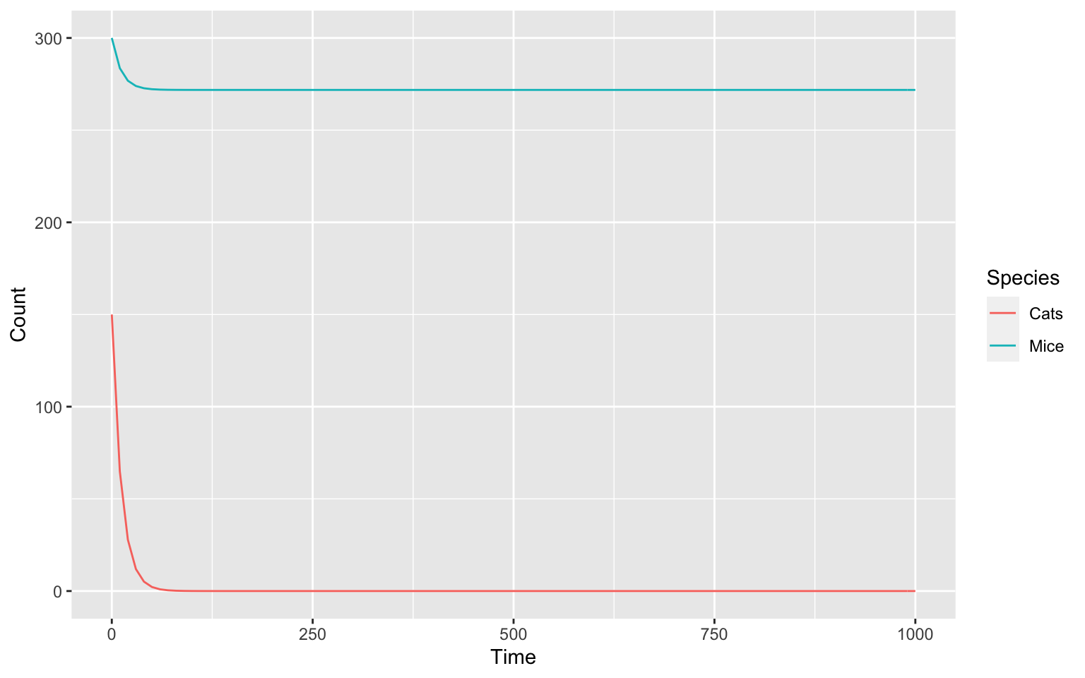
Parameters of the model:
We have to do something similar for our parameters to achieve the correct behaviour.
Code
# Take a look at the parameters and change them to what you think is a good value.Hint
First, we need to look at our parameters. Try doing that in a similar fashion to how we looked at the species. The setting of the parameters is also similar to how we set our species.
To decide what values to use, think about how fast reactions should be compared to the others.
Solution
First, let us take a look at our parameters.
getParameters()
#> # A tibble: 4 × 5
#>   key                          name  reaction                value mapping
#>   <chr>                        <chr> <chr>                   <dbl> <chr>
#> 1 (Cats ->).k1                 k1    Cats ->                   0.1 <NA>
#> 2 (Mice ->).k1                 k1    Mice ->                   0.1 <NA>
#> 3 (Mice -> 2 * Mice).k1        k1    Mice -> 2 * Mice          0.1 <NA>
#> 4 (Cats + Mice -> 2 * Cats).k1 k1    Cats + Mice -> 2 * Cats   0.1 <NA>
We can see that all parameters have the same value. This is an initial default and does not seem to permit the model to oscillate. We can fix this by manually setting sensible parameter values. To achieve this we are able to use a similar set of functions as we used for the model species.
For the key argument in the setParameters()
function we this time list all the parameters in order to specify the
new values in one command.
setParameters(
  key = c("(Cats ->).k1", "(Mice ->).k1", "(Mice -> 2 * Mice).k1", "(Cats + Mice -> 2 * Cats).k1"),
  value = c(0.05, 0.05, 0.1, 0.1)
)
We can now again take a look at how our model behaves. Try making the plot yourself.
Code
# Make a plotHint
We already made a plot above. We need to run a time course to get our
data for the plot and then use ggplot for plotting. This time, we also
need colours; so take a look at the color argument of the
ggplot aes() function, where we specified x
and y.
Solution
First, we will run a time course. We set the duration of the time course to 1000 and the delta t low, so we get a smooth output.
timecourse <- runTimeCourse(duration = 1000, dt = 0.1)If you take a look at the timecourse variable by typing
the variable in your console we can see that it is a list of a lot of
different points. We are only interested in the result
part. You can subset lists in R with the $
operator.
timecourse <- timecourse$result_numberThis is now a table of our species, but ggplot needs all values to be
in one column and any differentiation between them (in our case the
species and time) in another column. This is also called the
long format of tables. We can use the
pivot_longer() command of the tidyr
package to easily reshape the data. Time is already in a separate
column, so we do not need to do anything with it. We can work with all
columns except time by specifying -Time. We use the
names_to argument to specify how we would like to call the
column where the names for the old columns should go; the
values_to argument does the same but for values.
timecourse_long <- pivot_longer(data = timecourse, -Time, names_to = "Species", values_to = "Count")To get a better understanding what the pivot_longer()
function does, you can take a look at the two tables:
timecourse and timecourse_long.
Now we have everything we need for ggplot. We call the
ggplot() function. As data, we need our prepared time
course, timecourse_long. On the x-axis we want the time and
on the y-axis we want the values (concentrations). To differentiate
between our species, we also need colour.
ggplot(data = timecourse_long, aes(x = Time, y = Count, color = Species)) +
  geom_line()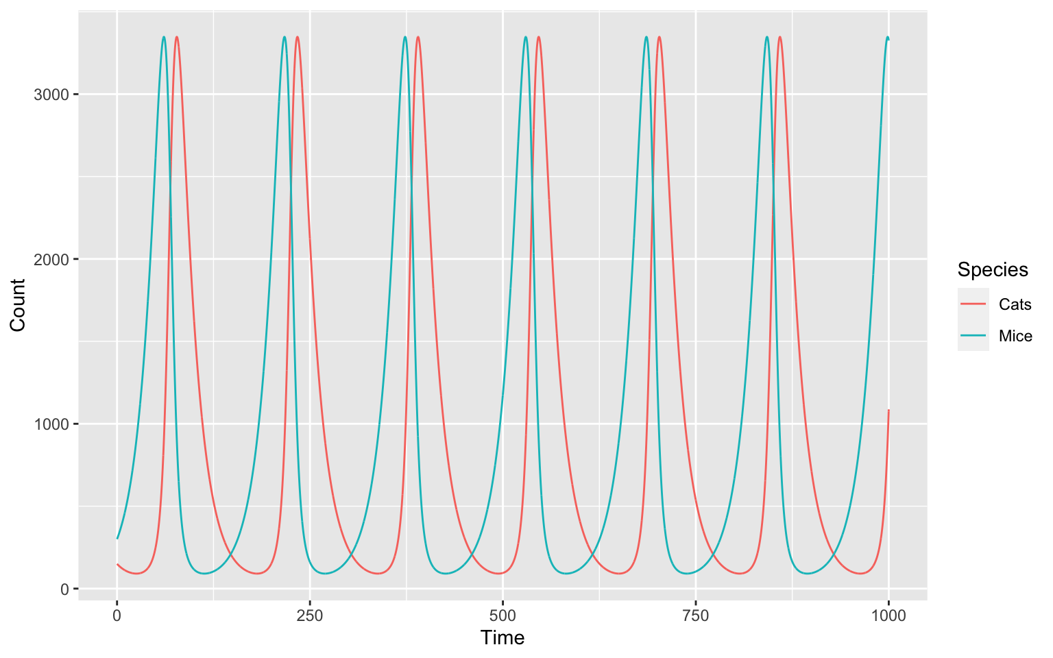
And we just made our own, oscillating model! But why and how does our model oscillate?
In a helpful review from Novák and Tyson 5 we find the following requirements for oscillators:
- Negative feedback to carry a reaction network back to the ‘starting point’ of oscillation.
- Negative feedback signal sufficiently delayed in time so we don’t get a steady state.
- Kinetic rate laws need to be nonlinear.
- Reactions that produce and consume interacting chemical species must occur on appropriate time scales.
We can try and explain how our model oscillates by going through those point by point.
- We have negative feedback - the more mice we create the more mice will be eaten by cats.
- The production of more cats following the production of lots of mice
takes some time. This is why we do not get a steady state.
- The cats and mice interact in the 4th reaction (Cats + Mice -> 2 * Cats) which creates a non-linearity in the system.
- They are in appropriate time scales: If our production of new cats would take years, whereas the population of mice would take days the populations wouldn’t sufficiently affect each other.
Phase space diagram
We can now take a look at our model in a different way. What do you think will happen, if we plot the two species of our model - one on the x-axis and one on the y-axis:
timecourse <- runTimeCourse(duration = 1000, dt = 0.1)$result_number

ggplot(data = timecourse, aes(x = Mice, y = Cats, color = Time)) +
  geom_path()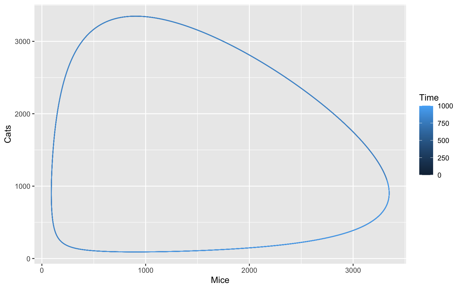
Sidenote: Notice how we use geom_path() instead of
geom_line() like before. You can try and see what happens
if you switch the two. Can you explain why?
The oscillation is periodic, meaning that it will always do the same thing over a specific period of time. It is like a steady state, but the steady state itself oscillates.
Some oscillations are also harmonic and return to this steady state, even when disturbed. We can try this with a parameter sampling of different starting conditions and plot these:
Code
We want 10 different conditions for starting values of our species. We want them normally distributed around the current value for each species with a standard deviation of 15 % of the current value.
sample_values_df <- tibble(Cats = c(), Mice = c())Afterwards, we want to run a time course for each of the ten
combinations in sample_values_df.
# run 10 time coursesAnd lastly, we want to plot everything.
# plotHint
You can generate random numbers that are normally distributed using
rnorm.
You can use a for-loop to run your time courses. Make sure you set your species to the new starting condition before each time course.
The plotting part should look similar to above.
Solution
First, we want to make 10 starting conditions. These should be normally distributed with a mean of the current initial concentration and a standard deviation of 15 % of the current initial concentration.
We will first generate a vector of our initial concentrations, called
initial_concentrations and a vector of our standard
deviation sd by multiplying
initial_concentrations with 0.15.
initial_numbers <- getSpecies(c("Cats", "Mice"))$initial_number
sd <- initial_numbers * 0.15
We can now create our sample_values_df tibble by using
the rnorm function. rnorm() creates
n random numbers, normally distributed around a
mean and with a standard deviation sd. We will
now fill our tibble with our two species:
sample_values_df <- tibble(Cats = round(rnorm(10, mean = initial_numbers[1], sd = sd[1])),
                           Mice = round(rnorm(10, mean = initial_numbers[2], sd = sd[2])))
sample_values_df
#> # A tibble: 10 × 2
#>     Cats  Mice
#>    <dbl> <dbl>
#>  1   136   368
#>  2   154   318
#>  3   131   272
#>  4   186   200
#>  5   157   351
#>  6   132   298
#>  7   161   299
#>  8   167   342
#>  9   163   337
#> 10   143   327
We will run 10 time courses with different initial numbers for our species in a for-loop.
The for loop runs for each row of the sample_values_df
dataframe, specifying an initial condition. Each time, the new initial
condition is applied, the time course is run and appended to a list
collecting all time courses. The results are merged into a single
dataframe tc_df with the column sample
specifying the iteration.
tc_list <- list()

# The for loop. sample is our loop variable
for (sample in 1:nrow(sample_values_df)) {
  # set the (random) initial number of the species
  setSpecies(key = c("Cats", "Mice"), initial_number = unlist(sample_values_df[sample, ]))
  # run time course
  tc_new <- runTimeCourse(duration = 1000, dt = 0.1)$result_number
  # append the new time course to tc_list
  tc_list[[sample]] <- tc_new
}

tc_df <-
  tc_list %>%
  # merge all outputs into a single data frame while distinguishing runs with the id (column sample)
  bind_rows(.id = "sample") %>%
  # convert sample to be a counter instead of the string representation
  mutate(sample = as.integer(sample))
The plotting works the similarly to before, but instead of
Time, we want to colour by our run counter
(sample).
ggplot(data = tc_df, aes(x = Mice, y = Cats, color = sample, group = sample)) +
  geom_path()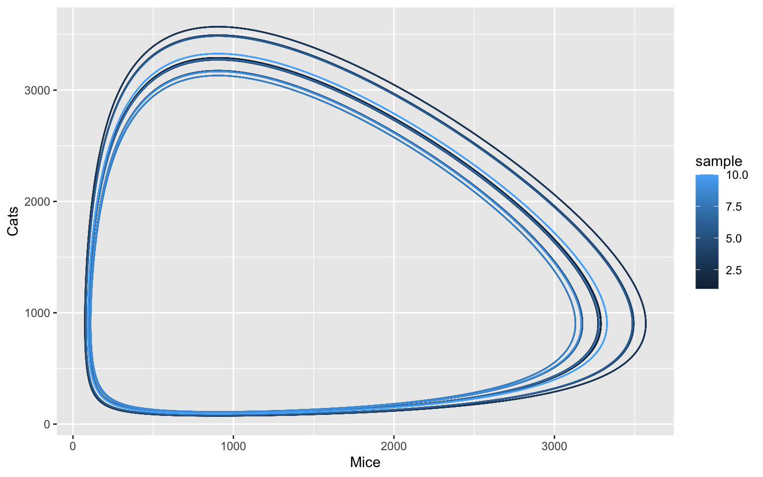
Trying this with with stochastic model
In reality, mice and cats are born and interact at discrete points in time. These single events, in principle, happen at random points in time, only the distribution of waiting times is defined by the system dynamics. In order to capture these (intrinsic) fluctuations in population numbers, normally a stochastic modelling framework is used 6. This can be done easily in COPASI and CoRC.
To start working with stochastic simulation, we need to implement a safeguard, which triggers in the event that the cats die out, causing the mice to reproduce indefinitely. In the deterministic model this is not a concern as the cat population can easily recover even from a total count of as low as e.g. 0.1. We use the COPASI event feature, which can finalize simulations by pushing the simulation time past the maximum duration.
newEvent(name = "tc_abort", trigger_expression = "{Mice.ParticleNumber} > 8000", assignment_target = "Time", assignment_expression = 9999)
#> [1] "((tc_abort))"
With this safeguard in place, we can switch to stochastic simulation. To illustrate the safeguard functionality, we use a particular random seed here for which we have observed that cats will die out in some of the samplings.
setTimeCourseSettings(method = list(method = "directMethod", use_random_seed = TRUE, random_seed = 14))

tc_list <- list()

# The for loop. sample is our loop variable
for (sample in 1:nrow(sample_values_df)) {
  # set the (random) initial concentration of the species
  setSpecies(key = c("Cats", "Mice"), initial_number = unlist(sample_values_df[sample, ]))
  # run time course
  tc_new <- runTimeCourse(duration = 1000, dt = 0.1)$result_number
  # append the new time course to tc_list
  tc_list[[sample]] <- tc_new
}

tc_df <-
  tc_list %>%
  # merge all outputs into a single data frame while distinguishing runs with the id (column sample)
  bind_rows(.id = "sample") %>%
  # convert scan to be a counter instead of the string representation
  mutate(sample = as.integer(sample))

ggplot(data = tc_df, aes(x = Mice, y = Cats, color = sample, group = sample)) +
  geom_path()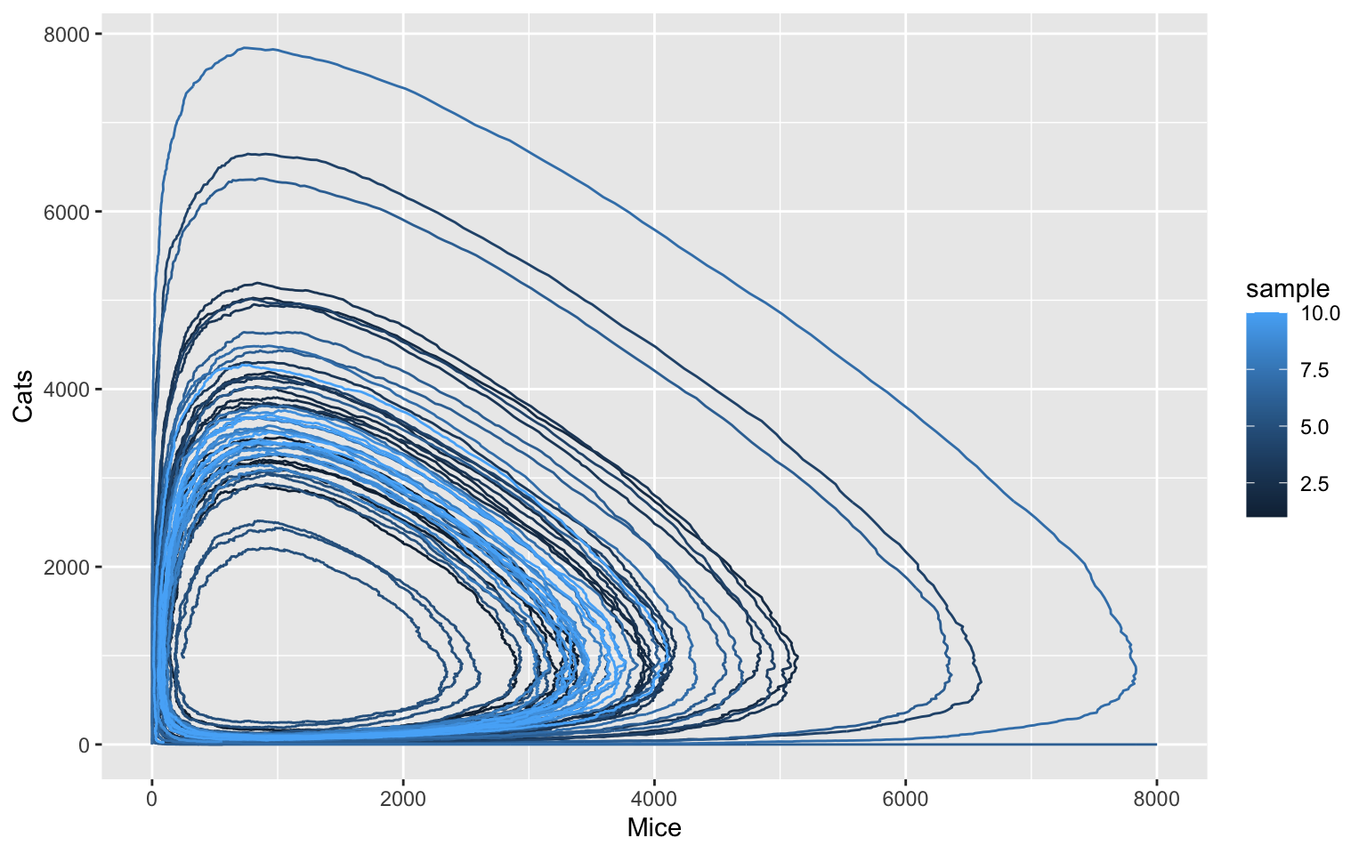
The stochastic simulation reveals that one can observe many more different model states than the deterministic simulation would suggest. While the oscillation behaviour is generally conserved, the random fluctuations can result in considerable perturbations.
3D-Oscillations
We will now take a look at another model. This model is about oscillations in calcium signalling (Kummer, 2000) 7. This model has three species: G-alpha, activePLC and Calcium. All three of these species can oscillate, so we can visualise this in a 3D-plot.
But first, we need to load our model and create a timeseries. We will use a duration of 24, which is 2 Periods with 10000 intervals.
loadSBML("https://www.ebi.ac.uk/biomodels/model/download/BIOMD0000000329?filename=BIOMD0000000329_url.xml")
#> # A COPASI model reference:
#> Model name: "Kummer2000 - Oscillations in Calcium Signalling"
#> Number of compartments: 1
#> Number of species: 3
#> Number of reactions: 8
if this does not work, try
loadSBML("https://raw.githubusercontent.com/jpahle/DynamiCoRC/main/models/BIOMD0000000329_url.xml")You can take a look at this model using the getSpecies()
and getReactions() function.
Code
Run a time course that we can use for plotting.
# run a time course
Hint
The time course needs two arguments, duration and
intervals.
Solution
The time course has two arguments: duration needs to be
set to 24 and intervals to 10000.
timecourse <- runTimeCourse(duration = 24, intervals = 10000)Visualisation
We will use the plotly package to make a plot, because ggplot2 does not support 3d graphics. With our plotly solution you can also interact with the plot in the browser.
plot_deterministic <-
  plot_ly(data = timecourse$result,
          type = "scatter3d",
          mode = "lines",
          x = ~ `G-alpha`,
          y = ~ activePLC,
          z = ~ Calcium,
          color = ~ Time)

plot_deterministic
See how we used the three oscillating species for our axes on the plot? It is a 3D-Limitcycle. If you want, you can investigate the behaviour of this model by plotting the three species over time.
Stochastic solutions
But we can also run this time course stochastically! For this, we
need the method argument.
Code
# Run time course
# tc_stochastic <- timecourse(duration = 24, intervals = 10000, method = )

# Make plotly plot
Hint
The method needed is called "directMethod". For the plot
our code will look very similar to before.
Solution
First, we run the time course. Here, we will use a random seed so whoever uses the code will get the same solution. But try it without the random seed several times and see if you get different solutions!
tc_stochastic <- runTimeCourse(duration = 24, intervals = 10000,
                               method = list(method = "directMethod", use_random_seed = TRUE, random_seed = 1))
Now, we will create another plotly-plot:
plot_stochastic <-
  plot_ly(data = tc_stochastic$result,
          type = "scatter3d",
          mode = "lines",
          x = ~ `G-alpha`,
          y = ~ activePLC,
          z = ~ Calcium,
          color = ~ Time)

plot_stochastic
As we can see, the two cycles for the deterministic solution do not really look all that different from each other. In contrast, the stochastic solution is really affected by random fluctuations. Using a different random seed, or just letting the cycle run twice drastically changes how our solution looks.
References
Kent, Edward, Stefan Hoops, and Pedro Mendes. “Condor-COPASI: high-throughput computing for biochemical networks.” BMC systems biology 6.1 (2012): 91.↩︎
Tyson, John J., et al. “A simple model of circadian rhythms based on dimerization and proteolysis of PER and TIM.” Biophysical journal 77.5 (1999): 2411-2417.↩︎
A. J. Lotka. “Analytical note on certain rhythmic relations in organic systems”, PNAS 6 (7) (1920) 410–415. doi:doi.org/10.1073/pnas. 6.7.410.↩︎
V. Volterra. “Variazioni e fluttuazioni del numero d’individui in specie animali conviventi, Mem. Acad. Lincei Roma.” 2 (1926) 31–113.↩︎
Novák, Béla, and John J. Tyson. “Design principles of biochemical oscillators.” Nature reviews Molecular cell biology 9.12 (2008): 981-991.↩︎
J. Pahle. “Biochemical simulations: stochastic, approximate stochastic and hybrid approaches.” (2009): Briefings in Bioinformatics 10(1):53-64, doi:10.1093/bib/bbn050↩︎
Kummer, Ursula, et al. “Switching from simple to complex oscillations in calcium signaling.” Biophysical journal 79.3 (2000): 1188-1195.↩︎